11 Jan, 2021
'/%3E%3Cdefs%3E%3ClinearGradient id='a' x1='0' y1='-5' x2='11' y2='-5' gradientUnits='userSpaceOnUse'%3E%3Cstop stop-color='%2300F'/%3E%3Cstop offset='.339' stop-color='%23A0A'/%3E%3Cstop offset='.677' stop-color='red'/%3E%3Cstop offset='1' stop-color='%23FA0'/%3E%3C/linearGradient%3E%3C/defs%3E%3C/svg%3E)
6 min read
The Data Handbook
How to use data to improve your customer journey and get better business outcomes in digital sales. Interviews, use cases, and deep-dives.
Get the book

If you’ve never worked in a consultancy, you might wonder what it’s like to work in a project for a client company. Or perhaps you’re curious to see what it’s like to work in a Columbia Road project specifically.
In this blog, I want to give you a more detailed example of what it was like for me to be part of a project that Columbia Road did for the city of Helsinki. I’ll go through the different stages of the project, how we approached questions that needed solving, and how we implemented our solution. I’ll also share my personal reflections.
Starting with a project – what is the goal?
The city of Helsinki owns hundreds of different digital channels in social media and web. However, the data from these individual channels has been located separately in each platform, making it challenging to get an overview of the different channels and comparing their performance. This lack of being able to see the big picture has made it difficult to understand the value of each channel in comparison to other channels.
The city of Helsinki wanted to have a centralised dashboard, which would combine data from different sources into one location. This dashboard would then need to be tested for approximately 10 months to see if this is the approach the city wants to take.
The dashboard would need to contain data from the following sources (with over 200 individual channels): Facebook, Instagram, Twitter, LinkedIn, Siteimprove, and Google Analytics.
Project walkthrough & stages
This is pretty much the chronological list of the different stages of this project.
- Understanding needs & setting goals was the first step of the journey. What are the underlying needs and how can we solve them in the best way possible?
- Validating the data funnel. Considering the complexity of the end result, we wanted to be sure that the chosen technological stack could do what we needed.
- Gathering data rights from different stakeholders and concentrated those rights on key accounts of the city of Helsinki. This was important as we didn’t want to rely on Public APIs from different data sources as they are somewhat restricted.
- Starting the architecture building process by building queries with Supermetrics API tool and dataflows in PowerBI. Dataflow entities allowed us to create automatically refreshing databases, which would then be used in creating the dashboard.
- First MVP version & feedback. At this stage, we had our first version of the MVP ready for comments and feedback.
- Building the second version. After the feedback round, we would build a second version where the focus would be in the usability and visual side of the dashboard.
- Maintenance support period. After everything was approved by the client, we started our support period, during which we would provide maintenance support for 10 months during which further changes would be implemented.
Key challenges
The biggest challenge in the project was the scope. Very few organisations have hundreds of different online channels. However, for this MVP, over 200 different online channels from six different data sources needed to be connected into one single dashboard. This meant that we couldn’t predict all of the challenges that lay ahead as no reference points of this complex dashboard exist. The scope also had major implications for the overall architecture of the dashboard.
Choosing tools
Considering the number of data sources or channels from different APIs, the platform chosen for this dashboard needed to be considered carefully and tested before the building process could start. First and foremost, the platform had to be flexible and customisable, as being able to categorise and customise data from numerous sources would be crucial for the usability of the dashboard.
We ended up choosing PowerBI as the dashboard platform. PowerBI Data Flows (ETL) together with Azure Data Lake were used to store data. To build the data queries, we used Supermetrics API tool and their own query builder. These queries would then be connected to the Azure Data Lake by PowerBI Data Flows.
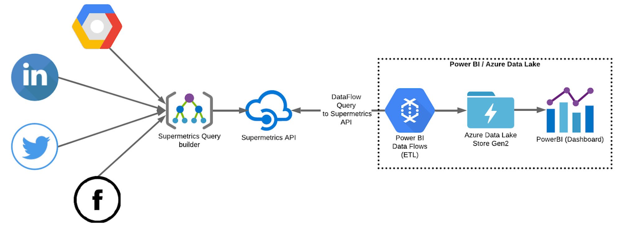
Building the Data Pipeline
PowerBI and the accompanying Dataflows + Azure Data Lake stack ended up being flexible enough for us to implement custom metrics and other required categorisation for data sources. We ended up having over 50 Dataflow entities and 10+ datasets from which we visualised the data. Since there was so much data to fetch, we built a systematic night-time refreshing system. On this scale, some queries can take up to a couple of hours to refresh, so having it done automatically every night helps to keep the data evenly updated.
In addition to PowerBI, Supermetrics API tool played a crucial role in the architecture. With the tool, we were able to easily create, segment and save our queries (and schemas) from different APIs. Again, considering the number of individual channels we were dealing with, this first step in the data-funnel process could have taken a massive amount of time, but Supermetrics API tool streamlined the process and allowed us to focus on the architecture at the PowerBI end.
Choosing and developing new metrics
In order for the city of Helsinki to gain a better understanding of their individual channels and how they compare with each other, we needed to carefully consider and compare different metrics that were available through the APIs. Moreover, we helped to further develop a completely new custom metric for Facebook, Instagram and Twitter data, called “performance index”.
The city of Helsinki had already created an initial version of this performance index, but after getting the data to the dashboard and seeing the results dynamically we helped them to develop it further. This was done by adjusting the formula slightly and trying different weights within the index.
This is what the index includes:
Post count = Post count * [MULTIPLIER]
Reach per post = Reach / post count * [MULTIPLIER]
Engagement per post = Engagement / post count * [MULTIPLIER]
Each of these three metrics have its own purpose in the index. By keeping post count as a separate metric we allow smaller channels (Facebook, Instagram and Twitter pages) to rise in the index by being active (which is important in social media). Reach per post tells us how big of an audience each post on average reaches, which is important as reaching as many residents as possible is important for the city. Thirdly, engagement per post tells us how well the content a single channel is posting resonates with their audience.
Combining these three new metrics with their individual multipliers creates an index, which gives a more realistic and complete perspective to a channel’s performance. Even though bigger channels (in terms of followers/likes) perform better on average in the index, the index also gives a chance for smaller channels to stand out in their performance.
Wrapping up the project – what did we achieve?
Getting an extensive view of the hundreds of different digital channels owned by the city of Helsinki used to be impossible as the data is scattered across multiple platforms and channels. The dashboard we built, allows the city of Helsinki to gain insights and a deeper understanding of their digital channels, and most importantly, it helps them to compare their performance. This information can be used to evaluate the importance of each individual channel, and to help them in making decisions regarding their future.
With an understanding of the overview, they can meaningfully dive deeper into more detailed metrics of the dashboard to gain insights on the underlying reasons for performance.
Highlights
- Over 200 different online channels from 6 different APIs combined into a single dashboard
- Helped to develop a new custom metric, performance index, to better understand the performance of each individual channel and to gain a more holistic view on the comparison of different channels
- Ability to compare different pages from different city operational branches
- Coordinated data-refreshing architecture (with PowerBI dataflows ETL) to store the data in the cloud (Azure Data Lake Store Gen2)
Personal reflections
Being able to work with many different companies and on projects that are vastly different from each other is one of the things I enjoy as a consultant. Different projects allow you to utilise your expertise in different ways, and to challenge your creativity in providing the perfect solution. This project, in its peculiarities, provided interesting learnings and a good experience.
Working with Supermetrics API
We chose the Supermetrics API tool for this project because of the vast possibilities in processing data. The tool allowed us to effortlessly create and modify queries which could be automatically refreshed and the data fetched seamlessly from multiple sources.
It was interesting to take a deep dive into the different social media and website analytic APIs and their restrictions. The Supermetrics API tool is versatile, but it cannot fetch more diverse or detailed data than what the original source provides. We needed to study the original data sources (eg. Facebook insights API) in order to find out what kind of data and metrics it’s possible to attain. Moreover, we needed to compare metrics across different sources to ensure that the sources define metrics in a correspondable way.
All our data sources were not supported by Supermetrics API, but it was possible to get around this by composing our own queries with the PowerBI Power Query editor. The Power Query M Formula language is a helpful tool with query sources that are not supported by Supermetrics API, and it also allows one to format data provided by Supermetrics API. With formatted data, it was easy to create reports and datasets, as well as to use the data in dashboards and the app that combined all the different PowerBI dashboards to one final dashboard.
Different APIs provide countless metrics and vast amounts of data, which meant that defining what is shown in the dashboard was crucial. The aim was not to replace channels’ own analytics dashboards, but to gather all important metrics to one centralised dashboard to get an overview of the performance of different channels. Choosing the right level and amount of detail was very important: with too many details the overall image might get unclear but some details can be crucial.
Ensuring a smooth project delivery
Dealing with so many stakeholders provided us with a challenge. Different stakeholders had slightly different needs and expectations for the dashboard, which meant that fulfilling all of them in one single dashboard was tricky – we had to consider carefully how to make the dashboard useful for every user. To ensure that the final product would provide a balanced solution for everyone’s needs, we conducted workshops to ideate and test, and collected feedback and iterated the solution to meet everyone’s expectations.
Gathering access to multiple data sources from all the different stakeholders wasn’t a walk in the park either – most of the data sources were managed by different people, and sometimes even finding out who’s responsible for some channel wasn’t that simple. There were no shortcuts to be taken; the owner or manager of each different data source had to personally provide access to the data. It took some time to get access to everything, but luckily adding more sources to the dashboard afterwards is simple, so we kept adding more sources as we received the rights.
Interested in learning more about how Columbia Road's full stack marketing projects provide wholesome impact, and what other types of projects we do? Take a peek at our full stack marketing service page to learn how we work, why that's a game changer, and how you can be part of it too.
