The Data Handbook
How to use data to improve your customer journey and get better business outcomes in digital sales. Interviews, use cases, and deep-dives.
Get the book Let's start with some typeface history
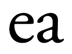
Books and newspapers are predominantly printed using serif typefaces, typically using Old-style typefaces like Garamond. These typefaces date back to 1465, to a time shortly after Johannes Gutenberg's adoption of the movable type printing press, or Transitional typefaces like Baskerville that first became common around the mid-18th century until the start of the 19th.
Originally serif typefaces were developed as they are because they are believed to work better for the body text. Serifs help guide the eye's flow through long pieces of text and make words more cohesive.

Digital changes the game
So as you can see, the printing press has been around for over 500 years. 30 years ago the quality of the text and even images in print was far superior than that of the computer monitors from the early 90s. Magazines could render images at 300dpi: 300 dots of ink per square inch of paper, or 118 per square centimeter. The equivalent ppi - pixels per inch of early monitors was far less, for example, the Extended Graphics Array (XGA), which was an IBM display standard and the most popular in the early 90s had only 85ppi.
However, serif typefaces did not render well on these low resolution monitors, small details that gave a serif typeface its personality appeared blurry or pixelated. This lead to the rise in popularity of the sans-serif typeface for digital use.

Sans-serif typefaces were most widely used for headlines and other short texts such as road signs and posters, they grab the attention of the reader – Arial and Helvetica are prime examples – with their straight lines and “sans ie. without” serifs they were a perfect match for these low-res early 90s monitors.
For the next couple of decades this trend continued. Later, font technologies such as antialiasing were introduced which improved the quality of the digitally rendered fonts and the pixel density of the monitors increased, but sans-serif remained the typeface style of choice.
Digital changes the game – again
In 2010, a watershed moment, the iphone 4 was released, Steve Jobs announced that “there’s a magic number right around 300 pixels per inch… the limit of the human retina to differentiate the pixels.” It turns out that Steve may have somewhat underestimated the limit of the human retina, which is at about 470ppi. Nevertheless it was the first phone to pass this 300ppi boundary, and when combined with antialiasing technology this allowed devices to render serif typefaces just as clearly as in print.
This was 8 years ago, but still today only one serif typeface is among Google fonts’ top 12: Merriweather, and popular frontend frameworks like Bootstrap and Foundation still default to the use of sans-serif typefaces for their body text.
The rise of sans-serif typefaces for use as body text was borne out of technical limitations of the time. We are no longer bound by these limitations. It’s 2018 and we live in a 4K world and the arms-race between smartphone manufacturers has produced screens like Sony’s Z5 Premium, with a truly eye-watering 800ppi.
At these high resolutions every faucet and characteristic of a serif typeface shines through, respected down to the minutest of details.
So, can we please now start using them?
The Data Handbook
How to use data to improve your customer journey and get better business outcomes in digital sales. Interviews, use cases, and deep-dives.
Get the book