29 May, 2018
'/%3E%3Cdefs%3E%3ClinearGradient id='a' x1='0' y1='-5' x2='11' y2='-5' gradientUnits='userSpaceOnUse'%3E%3Cstop stop-color='%2300F'/%3E%3Cstop offset='.339' stop-color='%23A0A'/%3E%3Cstop offset='.677' stop-color='red'/%3E%3Cstop offset='1' stop-color='%23FA0'/%3E%3C/linearGradient%3E%3C/defs%3E%3C/svg%3E)
7 min read
The Data Handbook
How to use data to improve your customer journey and get better business outcomes in digital sales. Interviews, use cases, and deep-dives.
Get the book
What is accessibility?
Accessibility, commonly referred to as A11y (because there are 11 letters between the “A” and the “y”) or “ally” is the practice of making your website or webapp usable by as many people as possible. This doesn’t just mean people with disabilities. It can, for instance include people with slow networks or old computers, but for the purpose of this article I’ll be focusing on people with disabilities.
Whom is accessibility for?
According to the World Health Organisation, 4% of people are visually impaired or blind. That alone is a lot of people, even before you consider that millions of people also suffer from other diseases that affect browsing the web. Autism, dyslexia, arthritis, learning difficulties – the list is long!
People with low or impaired vision
The size and weight (thickness) of a font is an obvious place to start when determining how easy it is for a user to read content on your site, but there are many other aspects to consider. Colour contrast - light text on a light background will be very difficult to read for someone with low or impaired vision, as would the use of text on images. Even with a drop-shadow on the text, letters can be impossible to make out if they are the same colour as that section of the image. Choice of font is also important; overly decorative fonts will be hard to read, especially at length.
Typography using animation or transitions to indicate action, may not be seen, especially if they are quick or if the animation takes place on another part of the screen from where the user is focused on (where the mouse is).
People who are colorblind
Color blindness has many forms: from monochromacy – total color blindness, seeing things only in grayscale, to the more common deuteranomaly – red-green colourblindness, which affects around 2.5~3% of the population. Using colours to indicate actions may not be noticed by colourblind users, neither would using colours to separate content.
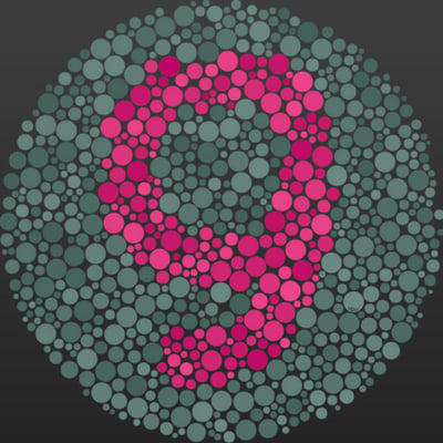
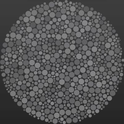
Image: Ishihara test – The same image as seen by users with normal vision and deuteranopia.
Be very careful when using coloured text on a coloured background. As you can see from the above image, reds on greens, or vice-versa would be very difficult to distinguish for a user with deuteranopia.
People with autism
Around 1 in 45 Americans between the age of 3 and 17 have been diagnosed with autism. Use of bright or vivid colours has been shown to distract people with autism and idioms e.g. “a kettle of fish” would cause confusion, as it will be taken literally. Walls of text are overwhelming for autistic people, and can be even for people without autism. People with autism are more comfortable with familiar behaviours and routines. Complex layouts, parallax scrolling or any non-standard browsing behaviour can be stressful for an autistic user.
People with dyslexia
It is estimated that 1 in 10 Americans has dyslexia, but only 1 in 20 of these realise it (dyslexia is not related to IQ – Einstein was dyslexic and had an estimated IQ of 160). Reliance on accurate spelling is clearly going to hinder dyslexic users, for example, when using a search input and having to match the term precisely.
But dyslexia is more than just having difficulty spelling or reading.
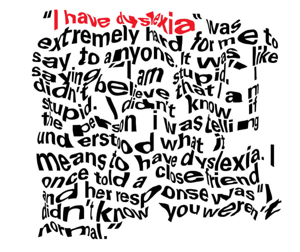 Image: "I have Dyslexia" by Hope Oliver, a graphic designer with dyslexia demonstrates how difficult reading can be with dyslexia
A lot of the aspects that hinder users with low or impaired vision will also affect users with dyslexia. Text too close together (letter-spacing and line-height), use of decorative fonts and too small text are likely to make for a bad user experience for people with dyslexia. Underlining text or using italics may not seem like it would be an accessibility issue, but the small difference it makes to text can make reading more difficult.
People with physical and motor disabilities
For users with arthritis in the hands and fingers using a mouse, keyboard or touchscreen can be painful, especially for an extended period of time. Parkinson’s and other diseases that cause tremors will also hinder users. Small buttons or small target areas for checkboxes will be harder to click or touch for users with physical or motor disabilities as would nested navigation that requires precise hovering.
Fatigue is another issue, long pages that require excessive scrolling or long forms that have multiple fields could cause pain or fatigue for users. This can also be the case if a website has short timeout windows forcing users to complete actions within a timeframe. Make sure your webstore’s checkout process allows enough time to complete the purchase before security time-out or, if you’re an airline, make sure users have enough time to complete a booking without losing the the price they were offered at the beginning.
Other disabilities and their difficulties with web accessibility:
Learning difficulties, ADHD
- Use of non-obvious icons, like the hamburger menu
- Verbose or complicated texts
- Voice consistency (e.g. 1st person, 3rd person)
Alzheimer's, Dementia
- Long forms to fill out (user can’t remember)
- Confusion about next steps
- Multiple steps
- Short timeout windows
Anxiety
- Short timeout windows
- Confusion about next steps
- Uncertainty about consequences of actions
- Hard to access help
Deaf or hard of hearing
- Important information in audio or video
- Lack of captions
- Telephone as the only means of contact
Epilepsy, motion sickness “Cybersickness”
- Flashing, high contrast colours
- Excessive use of animations or transitions
- Parallax, non-default scrolling
Good design = Accessible design
When reading the list of factors that can cause problems for disabled people, it should be quite apparent that the solution to several of them is just “good design”. Small buttons, long forms, bright vivid colors, flashy animations are not examples of good design. Parallax scrolling may seem “cool” but is it necessary? Does it bring any value to the user?
“Accessibility isn’t a set of design restrictions, rather it should be seen as a guide to a 'baseline of usability' something to be built upon."
Just because color-blind people won’t be able to see your website’s colors, doesn’t mean your website should be in black-and-white. Accessibility is a baseline: A website should be usable by everyone. The process of adding an item to the cart should not be made more difficult because of the small size of a button.
How to make a website accessible?
“How” is the hard one! There is no silver bullet, magic stylesheet or javascript plugin that will make your website accessible. When possible it makes things far easier if accessibility is thought of at the beginning of the project. Making a website accessible after it has been designed and developed is far more difficult. (I speak from experience!)
Quick wins
IMAGES
DO: <img src="sunset.jpg" alt="A couple enjoying the sun setting over helsinki">
DON’T: <img src="sunset.jpg">
Add an alt text to all your images to describe what is happening in the picture. For people with low or impaired vision who rely on screen readers the alt text will be read out loud.
LINKS
<a href="blog.html" title="link to the blog page">
The title will be read out by screen readers
<span tabindex="0">show content</span>
Adding a tabindex of 0 will allow elements that are not natively focusable (such as <div>, <span>, <p>, and <a> with no href) to receive keyboard focus.
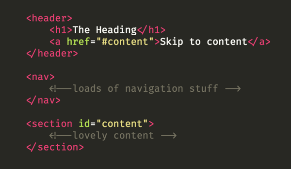
Image: Example of an HTML skip link, invisible to the eye, but can be “focused” by keyboard navigation.
“Skip links”, so called because they allow a user to skip straight to the main content of a page, are very helpful for people using screen readers. They should be visually hidden from the page, since people with no visual difficulties can navigate normally, but it is a good practice to make them visible when focused. For example, when someone uses a keyboard to “tab” to the link.
BUTTONS
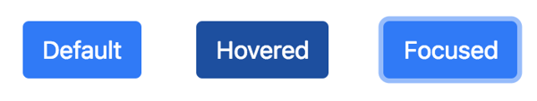 Not everyone uses a mouse. Instead, a keyboard might be a user’s preferred way to interact with the webpage. It should be apparent to a user without a mouse when a button is in “focus”. This is when a button has been navigated to via the keyboard (usually by pressing the tab button.) Make sure you account for this in your stylesheet, as a browser will not add any styles to a focused button unless they are specified. Don’t let a purchase fall through just because the customer could not find the “make purchase” button.
.button {} /* default styles */
.button:hover {} /* hover styles */
.button:focus {} /* focused styles */
SEMANTIC MARKUP
You can get very far alone with just using semantic html:
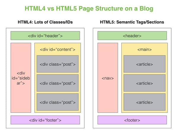
Left = bad: All divs give no indication to screen readers what content is in each section.
Right = good: The use of “nav” tells screen readers that this section contains navigation elements, “main” contains the main section of the web page, “article” contains the content.
FUZZY SEARCHING
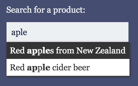
Image: An example of a search box with fuzzy search suggestions, notice how “apple” is misspelled
Using “fuzzy searching” with autocomplete will still show search suggestions despite spelling errors, helpful for people with dyslexia or learning difficulties.
MOBILE MENU AT THE BOTTOM
We are accustomed to menus being at the top of the screen on desktops, but simply inheriting this design for mobiles can cause the menu to be out of reach of the thumb, see above. Placing the menu at the bottom of the screen will be a lot more comfortable, even for people who don’t suffer from any physical disability.
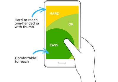
Image: Heatmap showing how hard it is to reach areas of a smartphone with the thumb.
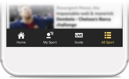
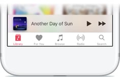
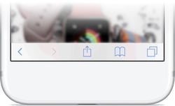
Image: BBC Sport, Apple music and Safari place their main navigation at the bottom of the screen for easier access with one hand.
USE FRAMEWORKS
The bootstrap and foundation frameworks are built with accessibility in mind. Using them as a starting point will help you to create accessible websites. Also consider when searching for Wordpress themes, plugins or when choosing an MVC framework like React or Angular to check if accessibility has been considered.
ARIA
WAI-ARIA, the Accessible Rich Internet Applications specification from the W3C's Web Accessibility Initiative, provides a way to add the missing semantics needed by assistive technologies such as screen readers. ARIA enables developers to describe their widgets in more detail by adding special attributes to the markup. Designed to fill the gap between standard HTML tags and the desktop-style controls found in dynamic web applications, ARIA provides roles and states that describe the behavior of most familiar UI widgets.
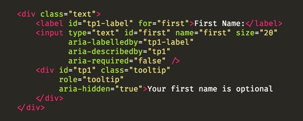 Image: Example of an HTML input field with aria attributes that will aid users of screen readers
Other examples of “widgets” that would require ARIA attributes are alerts, modals, carousels, dropdowns, paginated content, collapsible content and tabbed interfaces – Basically anything where content on a page is hidden, then revealed by some user interaction. As mentioned, the bootstrap framework will provide ARIA support for many of these widgets.
PRINT STYLES
Many people will print a website, especially if they suffer from chronic migraines or epilepsy. Have a well-structured “print” stylesheet to ensure your website’s design looks good on paper.
@media print }
// styles elements for print
}
Testing
Every web developer has – at some point or another – tested their app on “old” browsers. Entire businesses are built around doing this with services like browserstack and Sauce Labs allowing you to do just that.
You spend hours making sure that element which uses display:flex will still look good on these older browser. Tweaking, re-testing, tweaking, re-testing and so on.
But a much more efficient use of time – when you consider the numbers (less than 3% of people use Internet Explorer and circa 10% of people have some sort of a disability or impairment) – would be to test for accessibility.
Turn on voice over, close your eyes and use your website...