18 Sep, 2017
'/%3E%3Cdefs%3E%3ClinearGradient id='a' x1='0' y1='-5' x2='11' y2='-5' gradientUnits='userSpaceOnUse'%3E%3Cstop stop-color='%2300F'/%3E%3Cstop offset='.339' stop-color='%23A0A'/%3E%3Cstop offset='.677' stop-color='red'/%3E%3Cstop offset='1' stop-color='%23FA0'/%3E%3C/linearGradient%3E%3C/defs%3E%3C/svg%3E)
7 min read
The Data Handbook
How to use data to improve your customer journey and get better business outcomes in digital sales. Interviews, use cases, and deep-dives.
Get the book
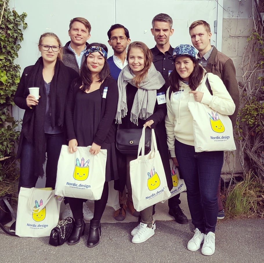
September was a busy month for us at Columbia Road, eight of the roadies in the design/frontend dev team headed to Stockholm to the Nordic.Design conference in Stockholm. It was a full immersive day with inspiring talks from great speakers and networking with other creatives. Here's the ten key things we learned in Stockholm.
1. How to build & ship a product in a productive and respectful way
Tim Van Damme, Head of Design at Abstract, talked about his learning experience building a new product. Previously, he has worked with products like Dropbox, Mailbox and Instagram. Here are Tim’s steps in building a product.
- Research & Evaluate
- Paper sketches & evaluate
- Pixels
- Prototype
- Build it
- Ship it
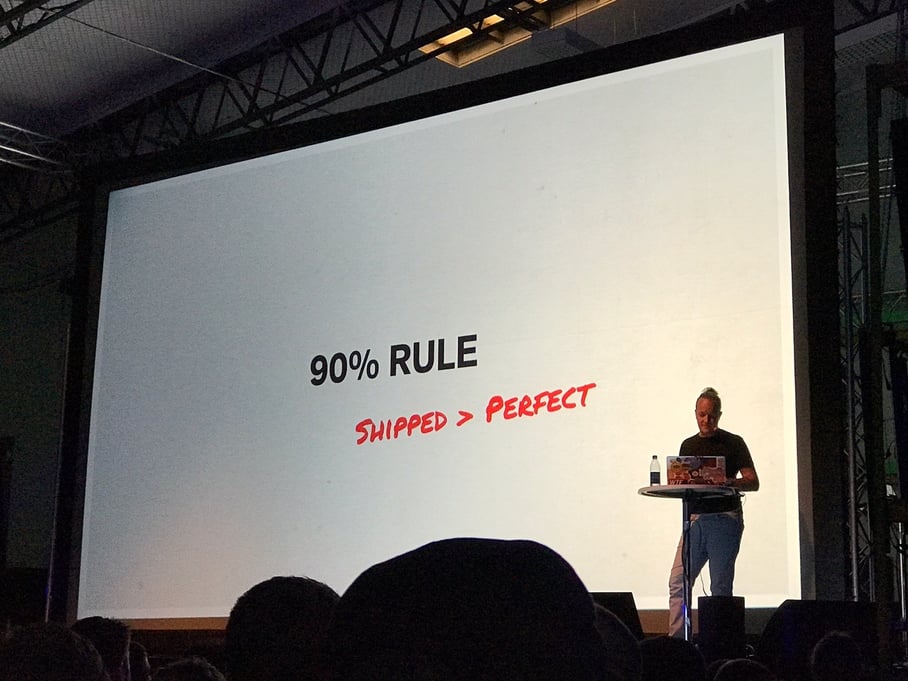
He emphasized that "Shipped is always greater than perfect" and that after you have shipped the product, it's very important to go back to stage one, do more research, user testing and evaluation with your users to take your product further.
I think that many companies get stuck at either the pixel or prototype stage, wanting to build the "perfect" product but then never takes it to market. Or worse, take it to market too late when someone else has launched it before.
An important takeaway is that as a designer, you have a lot of power on how long the build or high the costs for something to be build will be. Good design is expensive and sometimes it’s better to design in stages instead of getting stuck at perfectionism.
"If you want to go fast, go alone, if you want to go far, go together" - African Proverb
2. Where did all the feelings go? - How to create a great shopping experience
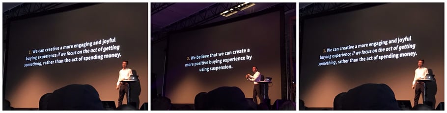
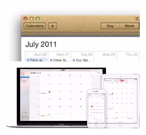
Tobias Ahlin, Lead Experience Designer at Minecraft compared how we have gone from a Skeuomorphism design trend to minimalism where clean and minimal styles are basically dominating the web and where many designs have been so strapped down to contain no feelings at all. As a concrete example, he compared the look of the Apple calendar from 2011 and how it has changed in 2017.
Tobias took the example of the Apple store and how they have managed to create a great shopping experience. For sure its minimalistic design looks great but what keeps customers coming back is the location, architecture, getting involved with the local community - and somehow they make you feel special.
He brought emphasis to the fact that as designers, we need to find the sweet spot between Minecraft animations and Excel where we can still design beautiful experiences but with some soul. A good use case of this is Ommwriter, a beautiful writing app that has been around for a while. It is minimal, beautiful, focussed, and has a great user experience.
3. Design in communication
Carly Ayes partner, writer, and Creative Director at Hawraf gave great tips on how to have a good conversation. Hawraf is born out of Google's Creative Lab where the studio focuses on how to create branding, communication and marketing to engage users in a new way.
She shared that every problem that we come across is a communications problem. By learning how to have great conversations and asking the right questions we can make a lasting impact. She also shared a great tip for design communities worldwide: Creative mornings, a great place for conversations.
4. Five things to avoid when designing for AI
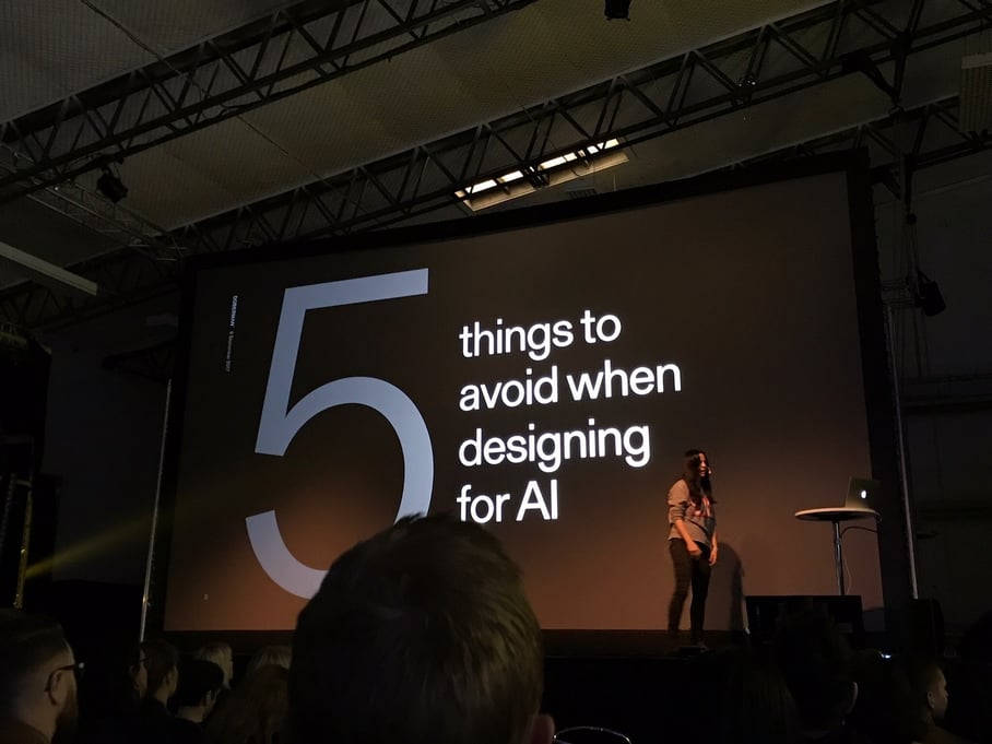
In a world where artificial intelligence is taking a bigger stage, Tove Blomgren, Creative Director at Doberman shared useful insights of what not to do when designing for AI. We better get used to talking to machines, but how do we design and build those AI experiences? With devices like Google Home and Amazon's Alexa they start to become more popular and they even started to make their way into our TV series. There is a great scene in Mr Robot showing our interactions with AI in a nutshell.
In the crowd of Nordic.Design, there were about 10% of designers working with AI, in 5 years this is going to be 90% so it’s definitely a space to watch out for. In Google labs, visual recognition is already being built. Natural language processing, Machine Learning, and Deep learning are just the beginning in this sphere.
Here are Tove's 5 tips to avoid when designing for AI:
1. Don't pretend to be human
Design smarter machines, not dumber people. Because it can easily get creepy.
2. Does your interface really need a sassy personality?
Add real value instead of gimmicks. Example of a bot with too much personality: Poncho the weather bot.
3. Don't confuse CUI with AI Chatbots.
Conversational UI is not AI.
4. Don't hide the seams, hand over the power to the user and be transparent.
Do you remember Tay? Microsoft's Twitter bot that got totally out of hand. Kayak has a good and transparent example of price prediction.
5. Don't use it because you can.
To help shape the future, you have to know where you want to go. Again, as designers we have a lot of power of the products we are designing. Think about integrity and focus, will it just add to the noise.
5. You need to have bad ideas to come up with good ones
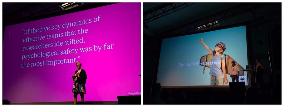
Willow Mellbratt & Petter Karlsson, play designers at Tokaboka, a Stockholm/San Francisco studio making digital toys from the kids perspective, talked about how you need a safe space for ideas and discussion. If you don't feel psychological safety in your work space where it's ok to have bad ideas, what is the likelyhood that you will come up with good ideas? We all look for that next "BIG IDEA", innovation, or move that will take us to the next level. If you don't feel safe with your peers to fail, the probability of you to share that next idea is going to be quite small. So give some space to your team and allow bad ideas and play to get to those brilliant ones.
6. Design. Code. Share
Krijn Rijshouwer, Product Designer of Framer took us through a demo of Framer, a new kind of design tool bringing design and code together. He talked about the importance of prototyping and how prototypes can influence meetings and help us making decisions faster.
He states that Framer is a quite good way for designers to learn how to code. In the tool's matrix of UX/Visual designers today, the landscape is rather diverse. We have static tools like Photoshop and Sketch, then we have interactive tools like Principle, collaborative tools like Marvel, and Invision app and other implementation tools as well. As a UX & Visual designer, I constantly need to stay up to date with new tools and ways how to present designs in the best way for clients and co-workers.
7. Scaling with design systems
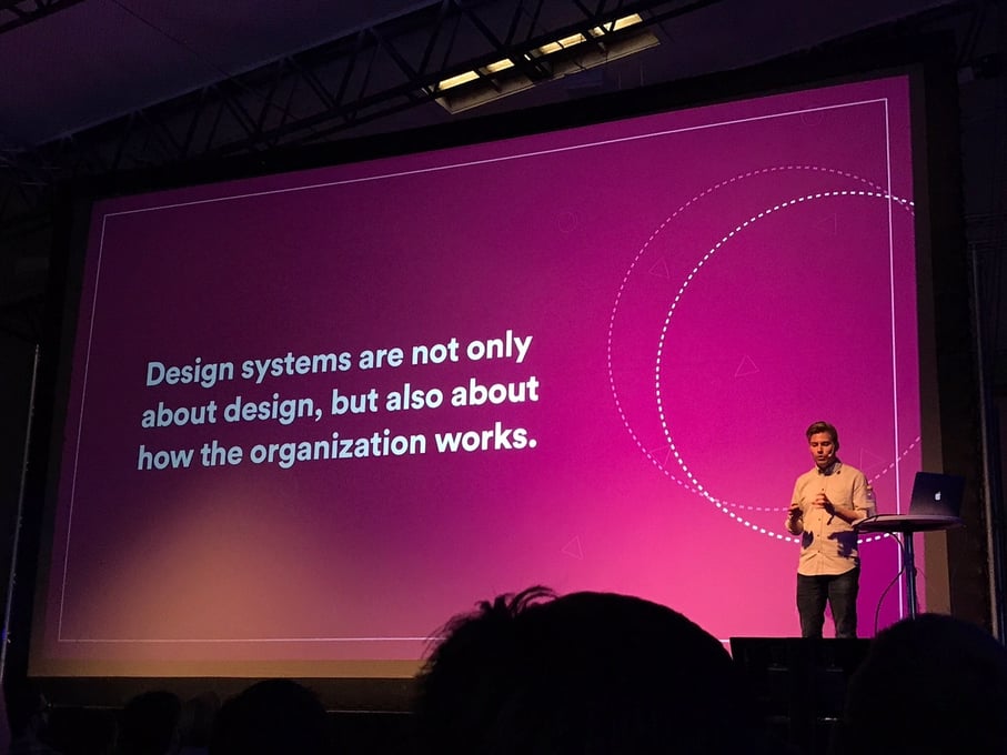
Lead Designer at Airbnb, Karri Saarinen shared his experience how Airbnb has grown and how he and his team collaborate to ensure consistency whilst they scale. Design systems have become increasingly popular with examples from Google's Material design, Shopify 's Polaris, Microsoft's system and many more.
"A group of people who use a common pattern language can make a design together just as well as a single person can within their mind" - Christopher Alexander, the timeless way of building.
So why have design systems become so popular in recent days? We live in a digital landscape where there is increased complexity, faster development cycles, mature platforms, and significant scaling of products and teams.
Today, when we develop products, there is larger need for consistency over user interfaces and across teams. At Airbnb, Karri has managed to create a solid, large and easy to understand system for both designers and developers including components in sketch and guidelines.
For any organisation scaling assets and content between Marketing, Sales, and Design/Development teams can be tricky. Lingoapp is a great resource that we use with some of our larger clients at Columbia Road. Bynder is another new comer that we haven't had the chance to try yet.
8. Lessons for bots, why do we need a bot? -Lessons learned from Intercom
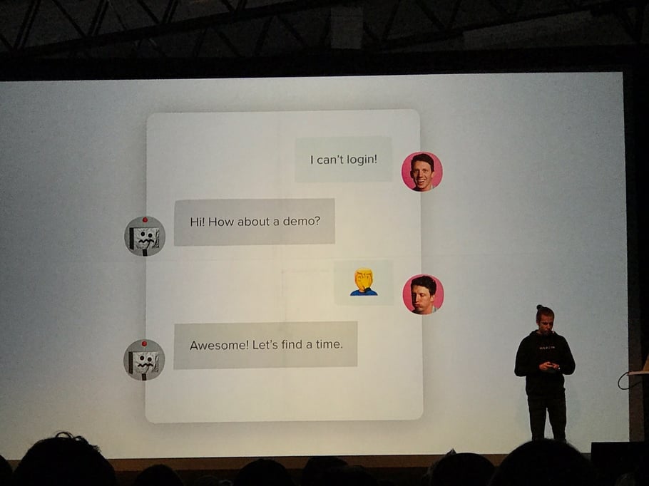
Bots are a hot topic these days and everywhere we turn, there are articles, discussions and opinions about bots and conversational UI. Bots seem to have found that sweet spot between love and hate. But how do create a great bot? What works and what doesn't? What should you think about when you build a bot for your business? Kostya Gorskiy, Product Design Lead at Intercom, shared some key learnings from one of the biggest and most successful companies out there making bots.
1. Do we really need a bot?
Or are we building one just for the hype? People don't want to talk to a bot, people want simple and easy solutions for their services.
2. You don't need a character
A good use case here is the Quartz news app bot that has no particular character or tone-of-voice. Instead, it's straight to the point, and the user has the power to explore more or less of what they want to engage with. It's a personal favourite that brings a new and fun experience to grasping the news.
3. Words matter a lot
Intercom did some experimenting and it turned out that wording matters. What does “soon”, “now” or “never” mean for different users? You definitely don't want to give the wrong expectations to your customers.
4. Why introverted bots work
Kostya refers to the Intercom bot as the world's first introverted bot with no subject, message or mention to itself and that might be one of the reasons why it has been so successful.
5. What are the principles of conversational design and why?
Kostya also talked about the "bot voice jail" - let me explain further. We all know those annoying answering machines to old fashioned banks where you have to type 1 through 9 to then lose yourself into the voice and then go back to option 1 and forgetting about option 5. The same thing can happen with bots and whatever you do, don't lock the user into a situation where he or she is trapped. There should always be an escape choice for the user. According to Kostya, The Google Allo bot is a good example of how not to build a "bot jail experience".
Don’t build a bot, build what is useful for your business.
9. Designing for television
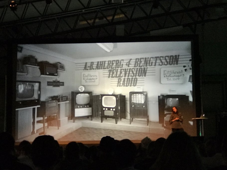 TV was also a hot topic in the conference. Molly Lafferty, Design Director at This Also is a pro and a sought-after name in TV design. She took us through a journey on how television has changed from 1939 onwards. Basically TV is dead and instead we now have Apple TV, HBO, Netflix, C-More and other services that only use TV as the screen. Molly talked about design specifics: how to design for the D pad (that remote control of yours where you navigate up/down/sideways), density, how to know where the cursor is and colour considerations. Yes, TV has a limited colour range compared to your laptop. In the future, I believe that TV UX design will become increasingly popular as these screens take a new turn in our lives.
10. Be bold
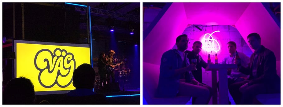 Summarising one of the most sought-after in the world of international design, the creative agency Snask, in a few words is almost an impossible task. After a full day of design talks, popcorn, candy-floss and networking with other designers, there was the final presentation which consisted of a mixed Keynote/Rock band performance. Snask is all but an ordinary agency who apart from making bold and visually striking commercials also launched their own beer (Shower beer), co-funded their own design festival and bought their own rock band Väg. During this fun and mesmerising session, they talked/sang about why we should gain enemies in order to bring gains.
Snask in a nutshell through their manifesto:
01/ If you don’t like your job – quit.
02/ If you love someone – let it show.
03/ Generosity always pays itself back.
04/ Always achieve greatness yourself before pointing out the faults and mistakes of others.
05/ Bureaucracy is spelled Bureaucrazy.
06/ Talk with clients like you talk to your family, friends and pets.
07/ Social skills are as important as being good at setting type or knowing how to spell.
08/ See people as people, not as target groups.
09/ Just because you wear a black suit, doesn’t mean you’re a goddamn professional.
10/ Having enemies is a good thing. It proves that you stood up for something sometime in your life.