8 Apr, 2019
'/%3E%3Cdefs%3E%3ClinearGradient id='a' x1='0' y1='-5' x2='11' y2='-5' gradientUnits='userSpaceOnUse'%3E%3Cstop stop-color='%2300F'/%3E%3Cstop offset='.339' stop-color='%23A0A'/%3E%3Cstop offset='.677' stop-color='red'/%3E%3Cstop offset='1' stop-color='%23FA0'/%3E%3C/linearGradient%3E%3C/defs%3E%3C/svg%3E)
3 min read
The Data Handbook
How to use data to improve your customer journey and get better business outcomes in digital sales. Interviews, use cases, and deep-dives.
Get the book

Earlier in the year, we attended a Google event in Stockholm featuring Lina Hansson, Conversion specialist, who shared useful tips for better mobile design for ecommerce. You can read our previous blog, part 1, on the topic here. It elaborates on how to increase mobile speed and conversion, and teaches how to conduct usability tests.
In this second part, we focus on online behavioural types, value propositions, mobile design, and how to overcome purchase anxiety. Pick up plenty of tips and examples of how you can level up your mobile design to drive more growth.
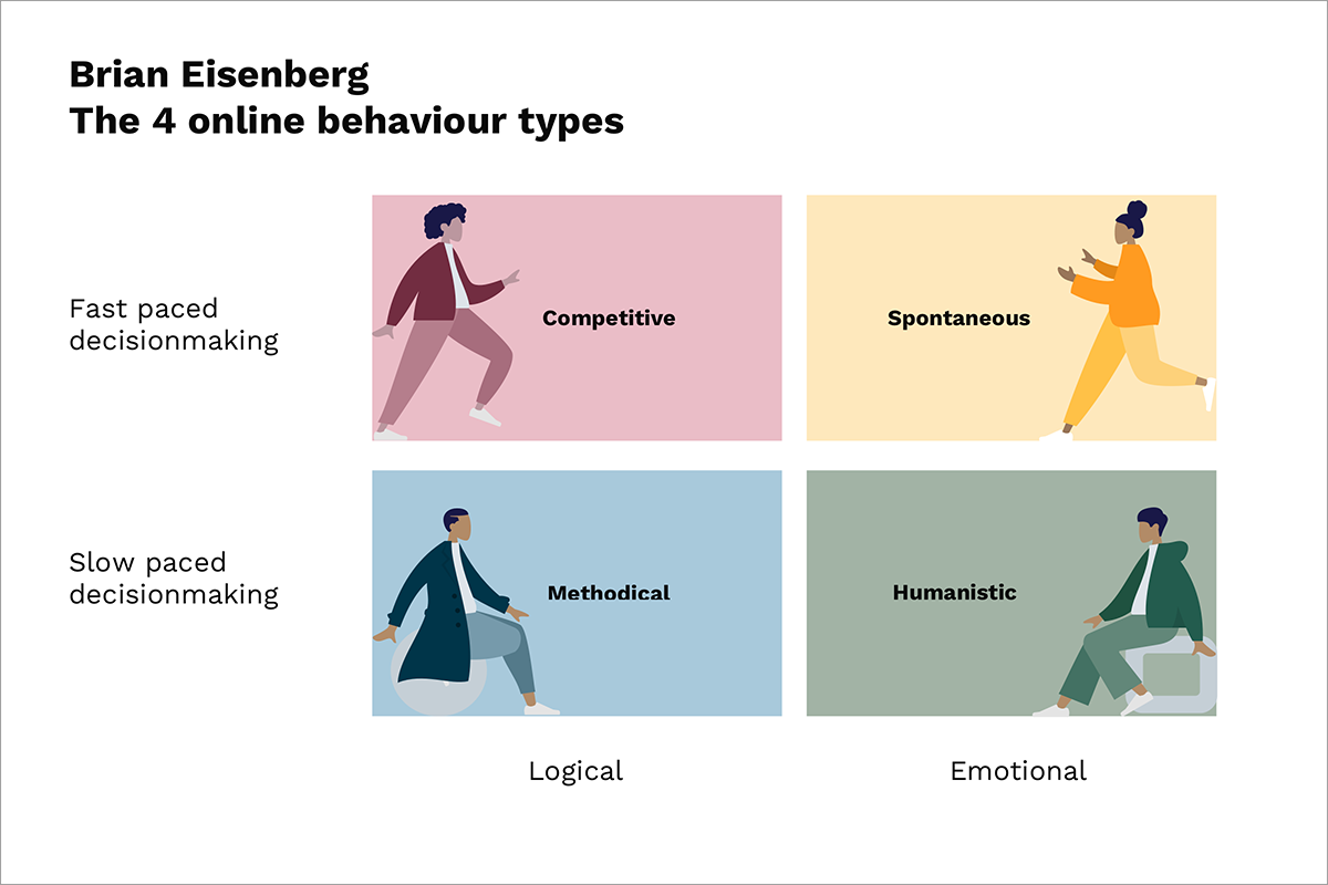
4 online behaviour types
According to Bryan Eisenberg, online behaviour for ecommerce can be divided into four different groups:
1. The competitive: logical and fast-paced decision making
- Wants to understand quickly
- Scans headers, bullet lists, icons, reads a few words in paragraphs
- Gets frustrated by bugs and weak clarity which make it difficult to find what they are looking for
2. The spontaneous: emotional and fast-paced decision making
- Values creation of a lifestyle, influenced by trends within the communities that they associate with
- Enjoys images and the communication style of a brand
- Often will not read small texts or long paragraphs
- Responsive to persuasion techniques
- Likes clarity and big buttons
3. The methodical: Logical and slow-paced decision making
- Places importance in making the right decision
- Will scroll through the whole page and read most of the text, even the long paragraphs and small text
- Wants to evaluate and compare, product comparisons are important
- Trusts experts, reads reviews and articles
- Example of a website that this type of person would like https://www.folksam.se/
4. The humanistic: Emotional and slow-paced decision making
- Trusts opinions of friends and reads reviews by users
- Enjoys images, especially if they convey people’s emotions
- Might read small texts and long paragraphs to know whether the purchase experience has been smooth, and whether complaints and reclamations have been handled well
What online behaviour type do you belong to?
How do you speak to each of these personas on your site?
You should structure the UX of your site so that you cater for all of these behaviours, but in different sections of your site. Especially if you have an international web store, it's crucial to capture the attention of each behaviour type. Are you following the ideal way of displaying content to users who pay attention to detail and who like to compare? The same applies to spontaneous or competitive users. Are you sure you’re captivating your customers the right way?
Have a clear value proposition
This might seem obvious, but you would be surprised to see how many sites are out there without a clear message of what the service is or what products are being sold. According to a Nielsen Norman Group study in 2010, 57 000 eye tracking fixation tests showed that users spend 80% of their time looking at information above the page fold (see the picture below). Even when scrolling, users allocate only 20% of their attention below the fold.
The two critical design elements that should be above the fold on your landing pages are:
- Call to action
- Value proposition
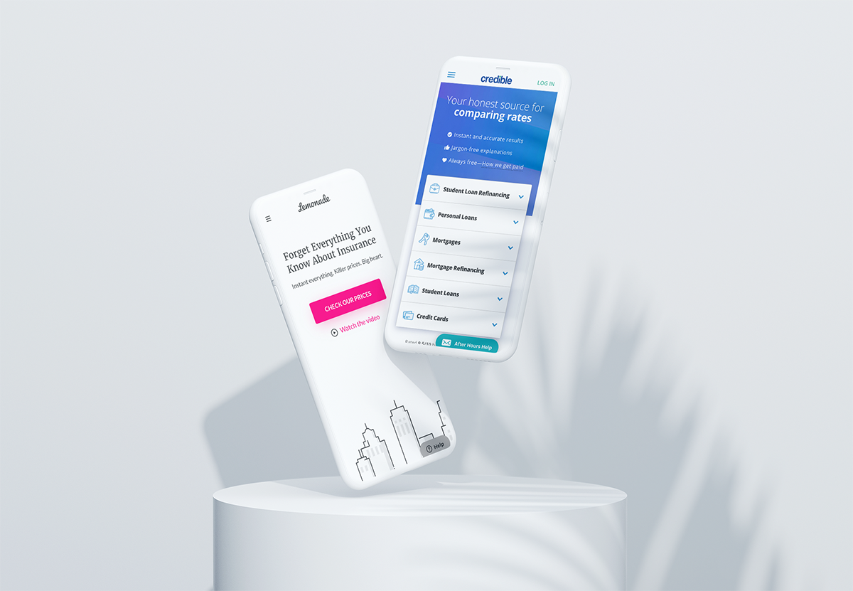

Four examples of mobile websites with clear value propositions above the fold: Lemonade, Mint, Asos and Tui.
Tui conducted a test and added their value proposition above the fold, which increased their mobile conversion rate with 8% and revenue by 11%. More revenue for such a small change. Hence, it is crucially important to communicate what your service is above the fold, also on mobile. Furthermore, the value proposition should be repeated and iterated across the whole conversion funnel. Make your texts shorter, concise, to the point. 79% of people don’t really read, they just skim. Hire a copywriter to go over the text on your site, it might be worth the investment.
“Get rid of half of the words on each page. Then get rid of half of what’s left.”
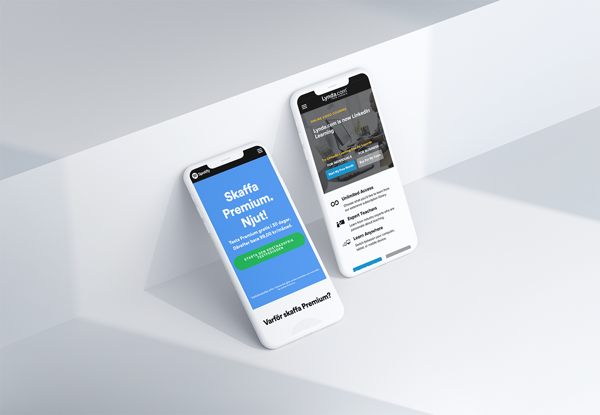
Two sites that have short and clear copy and call to action on their landing pages: Lynda and Spotify.
Other mobile design tips
- Reduce distraction, people look for patterns and associations
- Make it easy for people to find what they are looking for
- Be careful with carousels (just go to this site and you’ll understand why)
- Create a sense of urgency
- Use reviews and decrease purchase anxiety
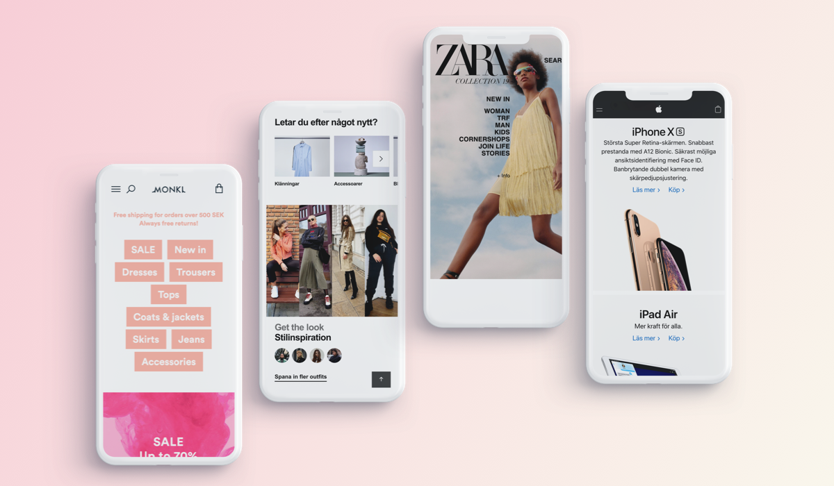
The biggest design issue on mobile for ecommerce — the hamburger menu
The categories that are visible on desktop, disappear in the hamburger menu, which is a quick and a lazy trick to sort out navigation. And to avoid prioritisation whilst hiding all that is important for your customers, if you ask me. What’s visible on desktop is simply hidden on mobile. Here are examples of how some retail brands have solved this issue (Monki, Zalando, Zara, and Apple) by showing the categories and helping the user to navigate.
3 biggest anxiety peaks for ecommerce and what you can do about them
1. Am I choosing the right product?- Give a great product comparison
- Provide a size guide
- Collect reviews
- Offer free returns
- Offer free deliveries
- Provide a delivery date
- Safe ecommerce badges, trust awards etc.
- Simplify design elements
- Close to 1-click purchase
Small tweaks go a long way. Most users don’t scroll until the bottom, so put your value proposition above the fold. Don’t do what everyone else is doing just for the sake of it, dare to challenge your design and test new things. It’s the only way to make progress and to excel in user experience.
Keen on learning more on growth hacking? Download your copy of the popular growth hacking canvas and start growth activities already today!
