16 Oct, 2017
'/%3E%3Cdefs%3E%3ClinearGradient id='a' x1='0' y1='-5' x2='11' y2='-5' gradientUnits='userSpaceOnUse'%3E%3Cstop stop-color='%2300F'/%3E%3Cstop offset='.339' stop-color='%23A0A'/%3E%3Cstop offset='.677' stop-color='red'/%3E%3Cstop offset='1' stop-color='%23FA0'/%3E%3C/linearGradient%3E%3C/defs%3E%3C/svg%3E)
5 min read
The Data Handbook
How to use data to improve your customer journey and get better business outcomes in digital sales. Interviews, use cases, and deep-dives.
Get the book

Have you ever wondered why some websites just look good? Does design sometimes seem to be some mysterious and difficult art? It doesn't have to be.
People can be more or less sensitive to visual design, but there are a few guidelines that you can learn and apply for a more pleasant visual experience. It takes time and specific skills to build and improve your webshop from a UX and Service Design point of view, but there are a few things that could be done to improve your overall shop experience.
How to use colour
Although the biggest design trend at the moment is white, flat, and almost colourless, it might make sense to use some colour - if done well.
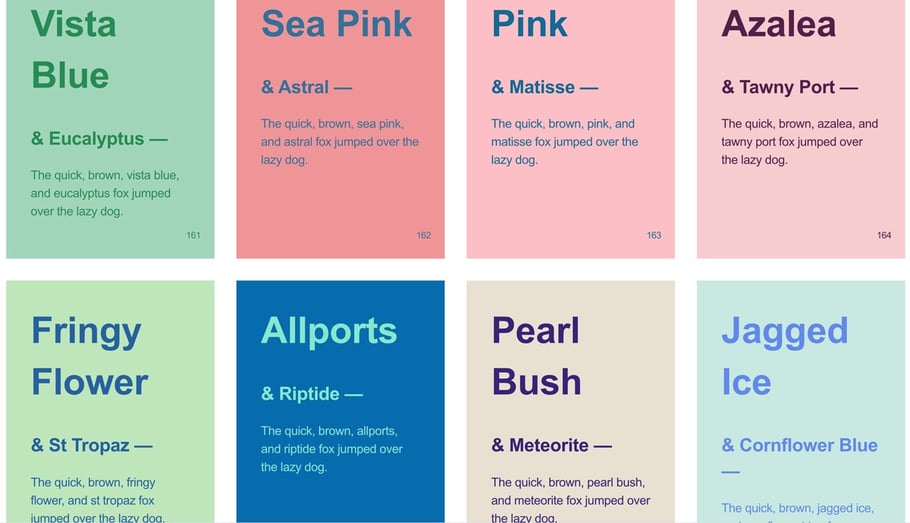
Often when we get to choose colours for a website or project, we become like kids, meaning that we can't resist but to add all of them. I've worked with some clients who sometimes had 16, 20, or even more palettes to choose from and wanting to add all of them to their website. The truth is that by mixing such a large amount of different colours it becomes very difficult, if not impossible, to build a recognisable brand for your users.
What colour do you associate Facebook, YouTube, Twitter, Amazon and other big brands with? Mostly just one colour right? Well there’s a reason for that. You want to keep it simple and if you want to have a few accent colors, that's totally possible if they all fit together and go well with your message and service.
The same could also be applied for the opposite. Working with black and white might also make your brand less likely to stand out against your competitors. For brands that use minimal colours, another way to gear up is to carefully use typography and shapes for differentiation.
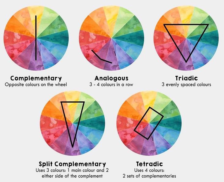
One way of choosing the right colours is to pick them in a certain way from the colour wheel. You can work with opposite colours, analogous, or triadic schemes. If you pick two main colours, then you can use darker and lighter versions of those two colours to build onto your palette which often makes the overall look and feel more harmonious.
For a webshop, you really want to reserve one strong colour that's not used anywhere else but for strong call-to-action buttons. If your shop has two or three other colours that are already very prominent, they are going to compete with your CTA buttons. You might want to consider using one colour for buy buttons, and another colour for viewing and reading content, for example.
Another thing to keep in mind is your content. If you are overusing colours, they might compete with your content. If you want your content to stand out, try to be more subtle with the rest so they don’t compete against each other.
Looking for inspiration? There are great resources to help you pick the right colours. Here are some of my personal favourites:
Khroma - AI color tool
Trendy web color palettes and material design color schemes tools
Color claim - Complementary colours that just work (the creator also has a great blog)
Design Seeds - Daily color inspiration + a great Instagram feed.
Some webshop examples that got colour right: The Dry Bar, William Abraham
Experiment yourself:
Adobe color wheel
Coolors
UI Gradients
Web gradients
Typography, the art of style
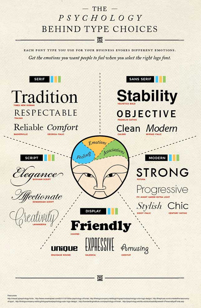
Another one of my favourite subjects, typography, can make your site work beautifully – or break any other efforts that you have previously made. Recommendations for typography are in line with colour choices: Less is always better than more. Stick to two or three font styles, not more, or it's going to look messy.
Make your text stand out and speak for itself, typography can never make up for bad copywriting. The quality of your message will always be most important, however, the right font can really highlight your message and change the perception of your brand. The style you choose should go with your brand and overall style.
Be aware of differences between titles and body text, not only style but also size. Sometimes I see examples where all text just blends in and it’s hard to grasp the hierarchy of the text. Make a distinct difference to bring some variety to your site and break up lengthy text. Most important of all, text should be legible.
3 golden typography rules
Font - Choose a font that is easy to read at all times (especially on mobile). Users spend a lot of time in front of their screens, you don't want to give your customers a headache while browsing your webshop. Although Sans Serif fonts have been very popular in recent years, Serif fonts with easier legibility are on the comeback due to rise in content focused marketing.
Contrast - 80% black is easier on the eyes to read than 100% black on a white background. Have a look at some designer websites and you'll notice that a lot of that black text is actually dark grey. Darker text on lighter background is always easier to read.
Size - Don't make the copy text too small (it's not a word document), think usability and what you want people to do with the information. Sometimes you need to put long text content on the web but then it should be broken up with images, quotes and divided into shorter chunks.
Using the right font with the right layout can make your customers feel more comfortable, increasing the chances that they will engage with your content which can help build trust and therefore gives you a better chance of growing your business.
Let’s face it, your business will not grow online if your visitors don’t feel comfortable with reading the material on your website.
Typography resources
2017 Trendy Google fonts combinations
Fontpair
Ginventory - Beautiful typography use
Nurture Digital
Publicis 90
The power of image
From time to time I see that a lot of work and effort has been put into a webshop, and then it all gets destroyed by poorly chosen images. There is such great photography out there today and even some stock photography could be purposefully used in the right context.
If you want a more personal experience, hire a photographer for a day to take pictures of you, your team, your products, or goods. Budget constraints? Hire an art/design student or ask a friend to help you out with product images.
The same goes for image editing. Photoshop can be a hassle and you might have other things you want to focus on. But today there are other alternatives for simpler image editing. One tool that is quite good is Fotor.
The truth is that the extra mile spent on your imagery and image editing could be a big difference for your business and sales conversion. Your customers can't touch or feel the products so the only information they have to base decisions on are the images.
Declutter and focus
No, more is not always better. I'd like to underline the word focus here. Sometimes I visit websites where as a user, you feel really confused. Do they want me to subscribe to the newsletter? Check out campaign 1, or maybe look at campaign, 2, 4, and 6? And what about this discount code?
If you communicate everything at once, your site will soon feel cluttered, intense, and unstylish and the user doesn't know where he or she wants to go or might forget why he/she came there in the first place. Feeling overwhelmed within a website can also lead to the customer simply navigating away from your webshop and deciding to go shop somewhere else (and might never return). That's a situation you don't want to be in.
Create some suspense, don't throw everything in the face of your customer. Let them navigate, explore and find their own way. How people browse webshops can be very different. Some people go straight to the social section and see what other people have bought and posted on Instagram. Some might go straight to the FAQ, payment and delivery section to find out about facts. Some just like to browse in an organic way through the different categories or theme pages.
Have patience. If your customer had a good experience and liked your webshop, he/she will come back. Building trust takes time and you'll have to prove why your webshop is worth coming back. Building a great Digital Commerce experience is all about the right set up, testing, measurement, evaluation and constant improvement.
So now you're worried that you have too many things going on? Try out this Japanese mindset (book about decluttering) and see if perhaps some of the ideas could be applied to your business.
If you don’t know what your focus is, remove more content that you’d really want to. Then introduce elements back one by one, A/B test to see which products work and which don’t. If you roll out all the 10 campaigns and features at the same time, how are you going to measure what worked?
Building a great webshop experience is a journey that takes time, needs constant iterations and also requires some bravery to test out new things and willingness to change together with your customers.
At Columbia Road, we believe that the best way is to start now, always experiment, and not be afraid of failing, learning, testing and then improving your service with your team and customers in a close relationship. That's the recipe for success.