22 Aug, 2022
'/%3E%3Cdefs%3E%3ClinearGradient id='a' x1='0' y1='-5' x2='11' y2='-5' gradientUnits='userSpaceOnUse'%3E%3Cstop stop-color='%2300F'/%3E%3Cstop offset='.339' stop-color='%23A0A'/%3E%3Cstop offset='.677' stop-color='red'/%3E%3Cstop offset='1' stop-color='%23FA0'/%3E%3C/linearGradient%3E%3C/defs%3E%3C/svg%3E)
4 min read
The Data Handbook
How to use data to improve your customer journey and get better business outcomes in digital sales. Interviews, use cases, and deep-dives.
Get the book

When I was 18, I worked at a sporting goods store. During the onboarding process, my boss said to me that the most important thing is always to serve the customer. "It does not matter whether you are organising the sock box or talking with a colleague: when a customer approaches the cash register, you stop whatever you were doing, serve the customer and collect the money."
This rule applies to both offline and online. The ultimate culmination point of business, where all the hard work aims to, is when the customer has decided to buy from you. Letting customers give their money to you should be the easiest thing in the entire process.
"Once users have selected the products they want to purchase, nothing should stand in the way." - Ecommerce User Experience Study by Nielsen Norman Group
Subscribing to a magazine, buying electricity, and booking a hotel room all have something in common, but what is it?
A similar purchase funnel.Let's imagine a situation where the customer is already in our purchase funnel. We are trying to ensure that the funnel ends in conversion and possibly builds a positive cycle for future purchases. What steps does the purchase funnel have? In a service business, the purchase funnel usually consists of 4 different phases:
- Choosing the product
- Entering information
- Paying
- Receiving confirmation
Choosing the product – minimise the feeling of risk and increase confidence
When we buy something, we usually have an internal monologue just before the final decision: Do I need this? Is this the best option for me? Should I still keep searching? What if I find something better? What if it's not good? Can I cancel it? In this phase of the purchase funnel, the focus needs to be on minimising the feeling of risk and helping the customer to feel confident about the decision.
Here are some tested ways how to improve conversion and user experience during the “choosing the product” step:
-
Most popular -tag
If a user is thinking of which option to buy, communicating which option people usually go for is one way of helping to narrow down the possibilities. -
Sense of urgency
Creating some sense of urgency has proven to work quite effectively. Something can be, for example, about to expire for the customer (e.g. current campaign ending, current contract about to expire, current credit trade payment program coming to an end). Creating a sense of urgency can also be about the product (e.g. campaign price expiration, running out of stock soon, etc.) -
Ratings & reviews
Real-life ratings are a good tool for decreasing the feeling of uncertainty. By looking at the rates, users can be more confident about buying the service as they know that others have had good experiences with the service.
-
Cancellation policy
When the user is buying something for the first time, the hesitation of "what if…" is always present. Communicating clearly about how the service can be cancelled lowers the feeling of risk and helps to make the final decision easier.
.jpg?width=750&name=Group%2063%20(1).jpg)
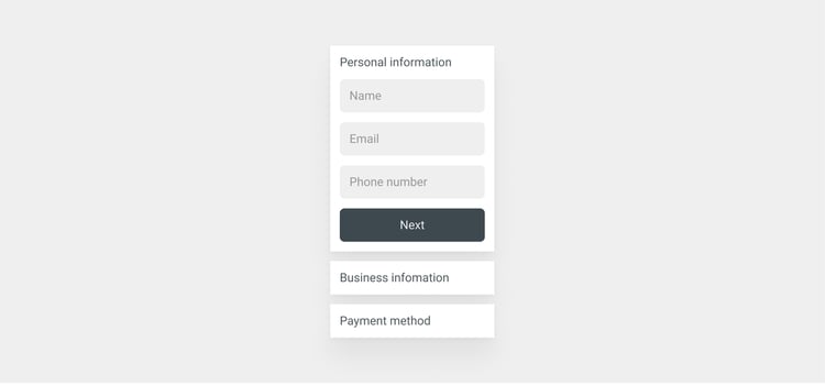
Entering information – make it E-A-S-Y
The phase where the user needs to add information, such as contact details, is usually crucial as it requires effort from the user. Succeeding in making this step as easy as possible goes a long way.
- Split the form
Seeing multiple unfilled fields might cause an overwhelming feeling and scare the user away with thoughts like, "I thought this would've been quick, I don't have time to do this now." Splitting the "work" the user needs to do into more easily digestible pieces helps smooth the way, especially for the users who feel overwhelmed by seeing too much information at once. - Automated filling of fields
If you ask for users to add the zip code, having automated pre-filling of the city and the area based on the zip code should not be too much to ask for. That is already a great improvement as you are removing two steps from your users to do list.
Payment – underline trustworthiness with visual elements
When users start to deal with money, their stress level is likely to rise. Testing the payment process with real users in real situations instead of qualitative tests with prototypes is important because the behaviour of the users might change radically when they have their real money on the line.
- Don't surprise the user with hidden costs
Exact information about the overall pricing should be visible during the payment so that the user can check the final price once more. At this point, there should not be any surprises regarding the price, such as hidden costs. Users are more likely to convert if the price is the same as what was promised in the discovery phase. - Utilise trustworthiness of payment options with logos
Familiarity makes us feel safer, especially when dealing with money. To make the payment step of the purchase funnel feel safer, make sure to show the logos of different payment methods. As they are already well-recognisable household names and feel more familiar, showing them makes buying feel more comfortable. - Align the third-party payment flow visually with the purchase funnel
When the user is directed to the payment service, make sure that it looks like it is part of the process visually. If the user is directed to a place that looks different from the rest of the purchase funnel, it might cause a feeling of doubt ("what happened, why this looks so different, this feels suspicious"), which can cause the user to ditch the process.
.jpg?width=750&name=Group%2062%20(1).jpg)
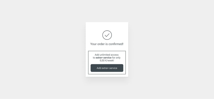
Confirmation – a good place to confirm and upsell
- Communicate the ending clearly
One SaaS company had a useless “save” button in their product that did nothing because the product had autosave. It existed just for the sake of giving extra confirmation to the user. It tells a lot about how much we want to be confirmed about the outcome; we want to know when something is really “done, finished, finito”. Communicating clearly about the end of the buying process is an important message, especially user experience-wise. - Start the onboarding
Especially in SaaS and subscription businesses, the engagement process must start immediately. Often, the first days and weeks determine the overall lifetime value of the user. Therefore, the onboarding process needs to be activated whenever there is a chance - in the confirmation step at the latest. Onboarding can be for example introducing features that users might have missed or encouraging them to download an app. - Upselling in the confirmation step
Upselling on the confirmation page is a low-risk place to try selling a bit extra. Users are proven to be in a buying mode if they end up on the confirmation page in the first place. Upselling on the confirmation page instead of in the middle of the purchase funnel is a more safe way to try upselling as it does not put the conversion at risk.
In the confirmation phase, the company should know at least something about the client's interests (because they ordered something). That data can be immediately used to create personalised recommendations regarding upselling.
If you aim to increase conversion and the user experience of the purchase funnel, remember that even small changes can bring big wins – the effort usually goes into finding the things that matter. If you are looking for ways to increase your ecommerce sales, I recommend testing them out!
Are you interested in learning more about ecommerce? Be sure to check out our other blogs on the subject as well!
