21 Aug, 2017
'/%3E%3Cdefs%3E%3ClinearGradient id='a' x1='0' y1='-5' x2='11' y2='-5' gradientUnits='userSpaceOnUse'%3E%3Cstop stop-color='%2300F'/%3E%3Cstop offset='.339' stop-color='%23A0A'/%3E%3Cstop offset='.677' stop-color='red'/%3E%3Cstop offset='1' stop-color='%23FA0'/%3E%3C/linearGradient%3E%3C/defs%3E%3C/svg%3E)
4 min read
The Data Handbook
How to use data to improve your customer journey and get better business outcomes in digital sales. Interviews, use cases, and deep-dives.
Get the book
Here at Columbia Road, we believe that there are no silver bullets or secret formulas when it comes to making purchasing online as easy as possible. Each product, company and their customers are unique. Consequently, improving the experience for both the online retailer and the online customer depends on the unique dynamic the two share. In this post we’ll share aspects we keep in mind when we set out to improve the purchasing experience.
Knowing your customers
This first one may seem obvious but it is typically not answered to to the extent that it should be. While many online retailers have a great understanding of their key demographic they may overlook the benefits of getting to know their customers on a more personal level. Gender, age and social status are important but aspects regarding personality traits, motivations and backgrounds are at least equally important.
Knowing your customers is crucial in order to understand what drives them. Personas are a great tool for building relationships with your customers. Designing with personas in mind helps you to form hypotheses about what could improve the customer journey. These hypotheses are necessary for A/B testing which can prove them true or false. Furthermore, personas help you to build an emotional connection with your customers and empathize with them. Once you empathize with the customer you can truly improve the experience for them.
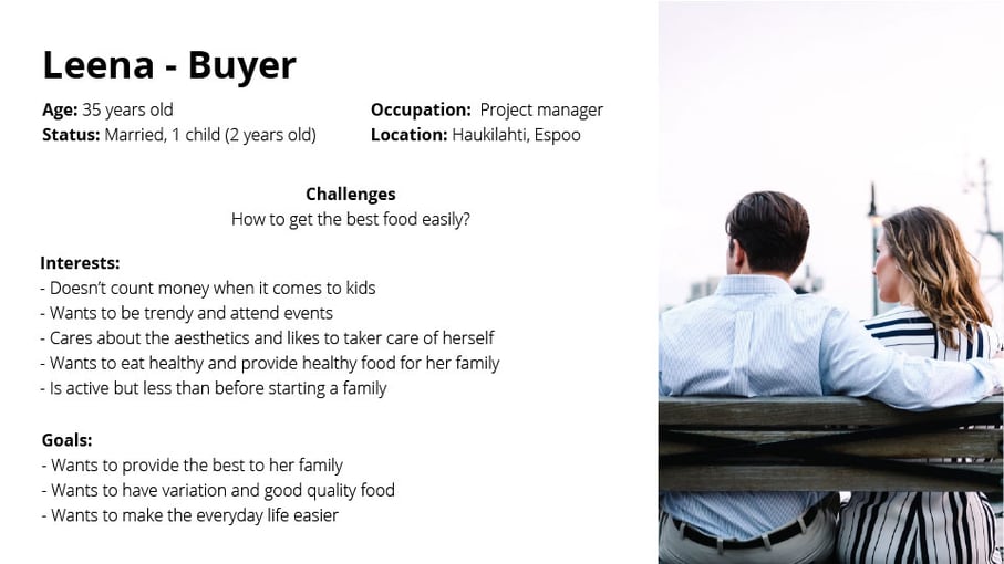
Example of a buyer persona
Nowadays, it has become necessary for companies to provide an omni-channel experience to their customers. It is critical to map out the journey of your customers and to assess their feelings at every stage. What are the areas where your customers are feeling frustrated? The further you go on this journey, the more opportunities and pain points you will discover. You can download our template for customer journey mapping here.
Interaction with your customers
In online retail, it is the retailer's task to accommodate a smooth and effortless purchasing experience. When interacting with the customer, we want to guide the customer in a way in which promotes smooth transition through the checkout funnel. Analytics provide us with accurate tools for identifying “leaks” in the purchasing funnel. Once you have pinpointed them, it easier to fix them one by one.
These “leaks” can be dealt with by forming a hypothesis on the reason for them, ideally accompanied with a possible patch for them. Set up an experiment to test your hypothesis.You will need to have a metric for your patches, and decide beforehand what are the actions after you have successfully finished the test and collected the results. It is also important to isolate your tests so that you can identify what worked and what didn’t.
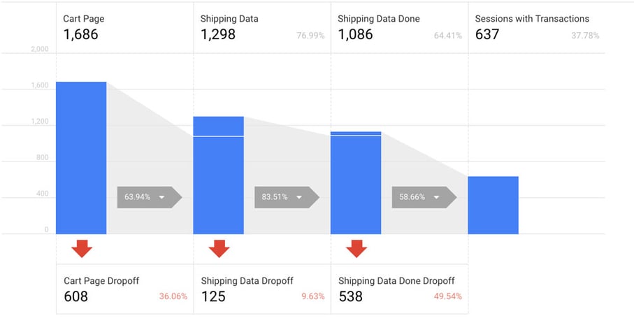
Example of checkout funnel from Google Analytics
When assessing the customer interaction in the purchasing funnel, these are four things to consider
Language
In order to connect better with customers, language should be clear, concise and useful. Through language, you can guide customers, especially in important pages such as customer service/help page, shipping delivery and return policy page, payment pages, etc. These are usually considered less pertinent than product pages or checkout flow, but are equally relevant.
As shown in example below, the first time you land on one of the product pages, a pop-up appears with instructions. The language is concise, and straight to the point: two sentences, four lines: “Click directly on the bike to change the colour of the trame, tires, saddle and grips, alternatively use the tabs above the bike. You can always click on the design tab to get back to your design.”
The focus is on the action the user can perform, by putting the verb first, instead of focusing on the technical aspects. The important part of the sentence is placed first.
BIKEID product wizard
Trust
According to a study from Bizrate Insights approximately 1 in 3 buyers report feeling reluctant to make online purchases. Hence, it is crucial to reassure the customer that your online store can be trusted and is safe. Customers will be unwilling to go through the checkout funnel if, for example, the checkout page has a totally different look and feel than the rest of the website.
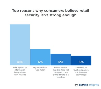
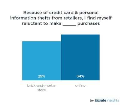
Statistics from Bizrate Insights
Efficiency
Checking out should not be a tedious task: it should have as few steps as possible. The forms should be consistent and understandable. There should be a part where you can enter your personal information, a part where you can see the products in your cart, a part where you can choose the payment and the delivery methods. The payment and delivery methods are where you can outshine your competitors.
In the example below, you can see that all the steps fit into one page. It is easy to scan the form, check the different payment methods, and the delivery option. After filling this form, you expect to be redirected to the payment provider, and then land on the confirmation page. The mandatory fields are clearly highlighted with a red asterisk.
Unfortunately, there is no clear indication about the delivery provider(s). You need to click on the terms and conditions to see that Fedex is the chosen distributer.
Checkout form from BIKEID
Visual feedback
Users like to feel that they are in control of their actions. It is important to give a visual clue to acknowledge that their action has been taken into account. If there is no visual feedback after an action, the user will most likely feel confused, since the user will not know if the action has succeeded or failed.
In the example below, clear visual feedback is given when adding an item to the cart. A box appears from the right with a smooth transition. In this box, you can see the picture of the product, the size, the price, the number of products, the total amount, and a button to redirect you to the shopping basket. This is very practical when you want to go straight to the checkout. Even though this box will automatically fade away after a few seconds, you can still see that you have a product in the shopping bag. It is visualised by a small brown circle with the number of items in your shopping bag.
Add to cart feature from Massimo Dutti
"An aesthetically appealing website does not necessarily result in a higher conversion rate."
Designing in e-commerce means placing conversion first, not aesthetics. While the appearance of an online store is important, it should not interfere with showcasing the products and services. An aesthetically appealing website does not necessarily result in a higher conversion rate. When it comes to design, a broader view is necessary.
It is important not to consider aesthetics and design interchangeable. While the practice of designing is often thought of as improving aesthetics, there are in fact many other factors which a design driven approach can improve.Practices such as design thinking help to both understand the users' needs and align the look, feel and functionality of an online store to fulfil them.
An important aspect we covered earlier is building trust between client and seller. Building trust through improved aesthetics alone is challenging (if not impossible). In order to make the purchasing experience comfortable instead of intimidating, a broader view of the experience is necessary. Typically, building trust is a matter of several minor improvements rather than a single major one.Design thinking methods help to identify where trust is gained and lost during the whole process and help translate these insights into concrete improvements. Naturally, the trustworthiness of an online store is not only limited to online experiences, but also aspects such as word-of-mouth referrals play a major role. On the other hand A/B testing helps to identify how minor changes affect the experience.
Although, attention to detail is important, it is crucial to study the process as a whole. Online stores are like machines with many moving parts and making one part move faster might not improve its overall performance.